The right planner layout depends on how your brain actually plans, not on what looks best in a flat-lay photo. Hourly and daily layouts suit anyone tracking time-blocked work or shift schedules; weekly layouts fit most people’s real rhythm; monthly and dashboard spreads handle the big picture. Pick the layout level that matches your planning habit first, then add one habit tracker or wellness prompt. Skip decoration until the function works.
TL;DR:
- Choose a planner layout that matches your planning habits, such as hourly, daily, weekly, or monthly, before adding extra features.
- Weekly layouts generally provide the best balance of detail and overview, with vertical and horizontal options suited for different organizational styles.
- Limit daily and habit tracking to three habits or goals per layout to prevent overwhelm and ensure consistency.
- Use color-coding and strategic positioning to highlight priorities, avoiding clutter and making essential tasks easy to find.
- Start with a simple, core layout and gradually add trackers or prompts only once the primary system becomes a consistent habit.
Table of Contents
- Classic Planner Layouts and When to Use Them
- Hourly Layout Ideas That Don’t Feel Cluttered
- Daily Layout Ideas for Deep Focus Days
- Weekly Layouts and the Vertical vs. Horizontal Question
- Monthly Layouts for Big-Picture Planning
- Horizontal Layout Ideas for Creative, Flexible Spreads
- Vertical Layout Ideas for Clean Column Separation
- Dashboard Layout Ideas for Command-Center Weeks
- Custom Printables and Builder Tools for a Perfect Fit
- How to Choose the Right Layout: A Short Decision Flow
- Building a Planner Routine That Actually Sticks
- Tips for Organizing and Prioritizing Tasks Within Layouts
- How to Add Goal-Setting and Habit Tracking to Any Layout
- Layout Examples for Students, Professionals, and Parents
- Common Mistakes to Avoid When Designing Planner Layouts
- A Simple Start That Actually Stuck
- Try a Planner Built Around This Exact Approach
- Where to Find Templates and Setup Guides
- Sources
Classic Planner Layouts and When to Use Them
Planner brands have converged on roughly seven classic layouts, and each one solves a different problem. None of them is universally “best.” The right pick depends entirely on how granular your day actually needs to be.
- Hourly: a column of time slots, usually 30 or 60 minutes apart, for back-to-back schedules.
- Daily: one full page per day, room for tasks, notes, and reflection.
- Weekly: seven days on one or two spreads, the most common planning home base.
- Monthly: a grid calendar for dates, deadlines, and milestones you need to see at a glance.
- Horizontal: rows instead of boxes, flexible for journaling or mixed content.
- Vertical: columns instead of rows, good for separating roles or task types.
- Dashboard: a command-center page combining trackers, goals, and notes in one view.
Hourly Layout Ideas That Don’t Feel Cluttered
Hourly layouts earn their keep when your day is built around fixed appointments: back-to-back meetings, shift work, or anything requiring true time-blocking. The failure mode is cramming every slot with detail until the page becomes unreadable.
- Use 30 minute blocks for standard workdays, 15 minute blocks only for the busiest stretches.
- Color-code by category (client work, admin, personal) rather than by urgency, which changes daily and forces re-coding.
- Anchor the page with a morning line and an evening line for quick top-of-mind notes.
- Add one habit checkbox at most, tucked in the margin, so the hour grid stays the focus.
Daily Layout Ideas for Deep Focus Days
A daily page works best when a single day carries enough weight to deserve its own real estate, project deadlines, big presentations, or a day you’re deliberately journaling through. It’s overkill for routine days.
- Use the formula: top three priorities, a task checklist, and a small reflection box at the bottom.
- Dated daily pages suit fixed routines; undated pages work better if your “planning days” don’t line up with the calendar.
- Reserve daily pages for the two or three days a week that actually need this level of detail, rather than filling one out every single day out of habit.
Weekly Layouts and the Vertical vs. Horizontal Question
Weekly is the format most people end up using as their real planning home base, since it balances enough detail with enough of the picture to spot conflicts before they happen. The setup guidance from Katie Leamon backs this up: fill your non-negotiables first, then build the weekly overview around them, then let daily tasks flow from that.
Vertical weekly layouts give each day its own column, better for people juggling several categories per day. Horizontal layouts give each day a row, which suits linear task lists and quick journaling.
- Vertical template: seven columns, three rows each (top priority, tasks, notes).
- Horizontal template: seven rows, split into appointments and tasks.
- Add a mini habit tracker as a strip across the bottom, a short meal-plan row if you cook on a schedule, and a “weekly priorities” box to keep focus on main items.
Monthly Layouts for Big-Picture Planning
Monthly spreads exist for one job: giving you a bird’s eye view of dates that matter across four or five weeks. Deadlines, bill due dates, birthdays, travel, and recurring milestones all belong here.
- Color-code by life area (work, family, finance) so patterns jump out at a glance.
- Add a small monthly goals box in the margin, separate from the date grid, so goals don’t get lost among appointments.
- Pair the monthly with a companion notes page for anything that doesn’t fit a single date.
- Keep the grid itself reserved for true anchors only. If you’re writing daily to do lists in monthly boxes, that’s a sign you need a weekly or daily layout instead.
Horizontal Layout Ideas for Creative, Flexible Spreads
Horizontal rows shine wherever content doesn’t map neatly onto discrete time slots, journaling, meal planning, or blended notes-and-tasks pages. The row format reads more like a list than a grid, which makes it forgiving for handwriting that wanders.
- Try a three-row formula per day: appointments, tasks, notes.
- Add a small tracker strip, water intake, mood, or steps, along the right margin instead of a separate page.
- Keep decoration (stickers, washi tape) along the row edges only, never inside the writing space, so the page stays functional first.
Vertical Layout Ideas for Clean Column Separation
Vertical columns work well when you’re separating distinct categories rather than distinct times, home tasks in one column, work in another, a side project in a third. It’s also useful for splitting a day into morning, afternoon, and evening blocks.
- Label each column with a short header, three or four words, not a full sentence.
- Add micro-checklists (three to five items) per column rather than open-ended space, which prevents any one column from sprawling.
- Stick to two colors per page. More than that on a small column layout starts working against readability instead of for it.
Dashboard Layout Ideas for Command-Center Weeks
A dashboard spread pulls your weekly mission, habit tracker, and running notes into a single page you check constantly, useful for weeks juggling multiple projects or for anyone who loses track of priorities easily.
- Build a “weekly mission” box: three sentences max, stating what this week is actually about.
- Add a habit tracker grid and a running notes column for stray thoughts and follow-ups.
- Include a mini project timeline, just a few marked dates, if you’re tracking something that spans multiple weeks.
- Reserve one small box as a “weekly focus,” separate from the task list, so priorities don’t get lost among logistics.
Custom Printables and Builder Tools for a Perfect Fit
Sometimes none of the classic layouts fit your paper size or habits exactly, and that’s when templates or builder tools earn their place. Canva’s planner templates cover weekly, daily, and monthly formats with fully editable text and graphics, a solid pick if you want something styled without designing from scratch.
For layouts that need exact measurements, a planner-builder tool generates print-ready PDFs with precise line and box placement in either US Letter or A4, which matters if you’re printing at home and hate mismatched margins.
- Pick a template when you want something styled fast with minimal fuss.
- Pick a builder tool when print precision matters more than decoration.
- Confirm your printer’s paper size before building, since US Letter and A4 use different proportions and will crop content if you guess wrong.
How to Choose the Right Layout: A Short Decision Flow
Most people overthink this. A short trial beats a long debate every time.
- Name your main planning job in one sentence: are you tracking time, tasks, or dates?
- Match that job to a layout level, hourly and daily for time and tasks, weekly for balance, monthly for dates.
- Build just that one layout and use it for two to three weeks before adding anything else.
- Adjust only what actually failed, not what merely looks imperfect.
Three questions clarify the decision fast: Do you plan by the hour or by the week? Do you need daily reflection or just a task list? Is your bottleneck visibility or detail?
Pro Tip: Start with one core page type and use it daily before adding trackers or extra sections. A visually quiet layout is easier to stick with than a packed one, and simplicity is what makes a habit last past week one.
Building a Planner Routine That Actually Sticks
A layout only works if you open the planner. Three short check-ins a day beat one long weekly session for keeping a system alive.
- Morning review: scan today’s page, confirm your top three priorities are still accurate.
- Midday glance: a 30 second check to see what’s slipping and adjust before the afternoon runs away.
- Evening reset: cross off what’s done, migrate what’s not, jot tomorrow’s first task.
Add a weekly ritual on top: migrate any anchors that shifted, pick your two or three priorities for the coming week, and prep your busiest day in advance.
Pro Tip: Attach your evening reset to something you already do, like brushing your teeth or making tomorrow’s coffee. Pairing a new habit with an existing one is one of the most reliable ways to make it stick without relying on willpower.
Tips for Organizing and Prioritizing Tasks Within Layouts
Most planner layouts fail not because the grid is wrong but because every task gets treated with equal weight. A page with fifteen unranked to dos is functionally the same as a blank page: you still have to decide what matters before you can start.
Limit yourself to two or three genuine priorities per day, chosen before you write anything else on the page. Everything else is secondary and can wait, move, or get dropped without guilt. This single habit does more for a planner’s usefulness than any layout choice.
Group tasks by type rather than by the order they occurred to you. A quick sort into “must happen today,” “can wait until tomorrow,” and “someday” takes fifteen seconds and prevents a to-do list from becoming a guilt list. Within a weekly layout, this sort can live as three labeled zones on the page rather than a separate system.
Use position, not just color, to signal priority. Top-left corners and the first line under a header get noticed first, so put your must-do items there rather than burying them in the middle of a block. Color-coding helps too, but only if you keep the palette to two or three meanings maximum. A rainbow of categories asks your brain to decode the page before it can use it.
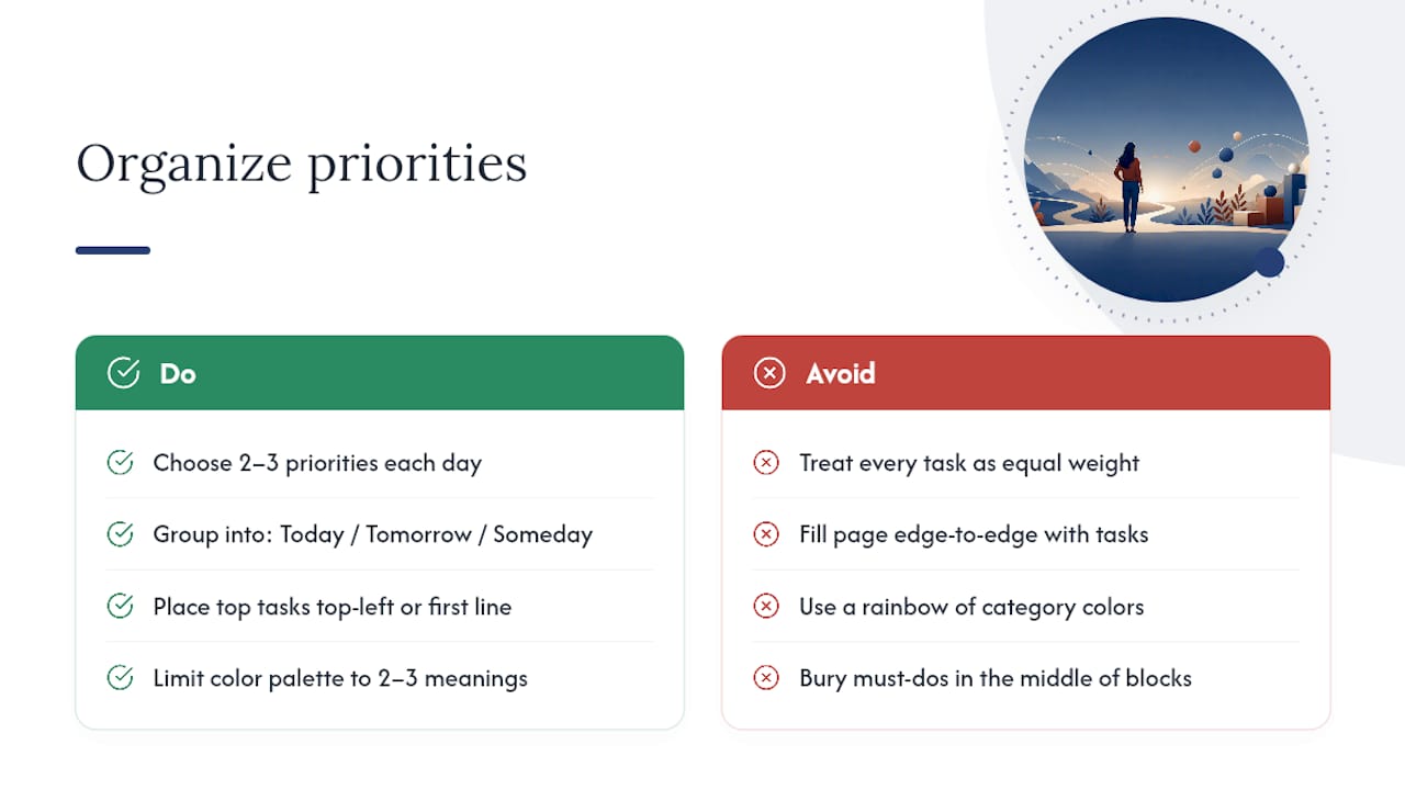
Leave visible white space on purpose. A layout packed edge to edge signals overload before you’ve read a single line, and it makes genuine priorities harder to spot. A little empty space around your top tasks does more for focus than another color ever will.
How to Add Goal-Setting and Habit Tracking to Any Layout
Goals and habits don’t need their own elaborate system. They need a small, consistent spot on a page you already check.
For goal-setting, add a single box, on the monthly spread or the dashboard, that states one or two goals in plain language, not a paragraph. Break each goal into the next concrete action and put that action on this week’s page, not the goal itself. A goal that never gets translated into a task on a specific day tends to sit untouched for months.
Habit tracking works best as a small grid, not a separate journal. A strip of five to seven boxes across the bottom of a weekly layout, one row per habit, lets you mark progress with a single tick mark and see the pattern build across the week. Keep the habit list short, three habits maximum on a starter tracker. A tracker with twelve habits gets abandoned faster than one with three, simply because filling it in becomes its own chore.
Tie habits to an existing routine rather than a new one. Marking your tracker right after your evening reset, for example, means you’re not adding a new thing to remember, just extending something you already do. The Thrive Life approach to wellness routines leans on exactly this idea: small trackers and prompts layered onto habits that already exist, rather than a whole new system bolted on top.

Review your habit grid and goal box once a week, during your weekly ritual, and adjust anything that isn’t working. A habit you haven’t checked off in two weeks probably needs a smaller version, not more willpower.
Layout Examples for Students, Professionals, and Parents
Students tend to do best with a hybrid weekly and daily setup: a weekly spread for classes, assignment due dates, and study blocks, paired with daily pages only during exam weeks or heavy project stretches. A vertical weekly layout works well here, with one column per day split into “classes,” “assignments,” and “study.” Add a monthly spread strictly for exam dates and major deadlines so they’re never buried in weekly detail.
Professionals juggling meetings and projects usually get the most out of an hourly layout for meeting-heavy days combined with a dashboard for the week overall. The dashboard holds the weekly mission, a running notes column for follow-ups, and a mini project timeline for anything spanning multiple weeks. On lighter days, a simple daily page with three priorities and a checklist replaces the hourly grid entirely.
Parents managing family schedules often do better with a horizontal weekly layout, since rows handle a mix of appointments, errands, and kid activities more naturally than rigid time blocks. A shared column or color per family member keeps everyone’s commitments visible without needing separate calendars. Add a meal-plan strip and a habit tracker for one shared family routine, bedtime, chores, screen time, rather than trying to track everyone’s individual habits on one page.
Common Mistakes to Avoid When Designing Planner Layouts
The single biggest mistake is choosing a layout for how it looks rather than how you actually plan. Planner experts consistently warn that function has to lead aesthetic choices, not follow them; a beautifully decorated spread you abandon in week two has done nothing for your productivity.
A close second: building the entire system on day one. Adding a habit tracker, a goal box, a mood log, a meal plan, and a project timeline all at once, before you’ve proven you’ll even open the planner daily, is a setup for abandonment. Start with one core page and prove the habit before layering on extras.
Overcrowding pages is another common trap. Cramming every possible category into a single spread, tasks, appointments, habits, notes, goals, leaves no visual hierarchy, so nothing stands out and the page becomes exhausting to scan. If a layout needs a legend to explain itself, it’s too complex.
Mismatched paper size causes more frustration than people expect. Printing a US Letter template on A4 paper, or vice versa, distorts margins and can crop off entire columns, so confirm your paper size before you build or print anything.
Finally, treating the monthly spread like a daily to-do list, or the weekly spread like a journal, blurs the purpose of each layout level. Each format has one job. Keep the monthly for anchors, the weekly for balance, and the daily for depth, and the whole system stays legible instead of collapsing into one overstuffed catch-all page.
A Simple Start That Actually Stuck
I started with just a weekly spread, nothing else, for about a month before adding anything on top. Once that habit held, I added a small habit tracker strip along the bottom, three habits, no more.
That one addition, paired with a short mindfulness check-in each evening, made the difference between a planner I opened occasionally and one I opened daily. What mattered wasn’t the tracker itself. It was starting simple and layering wellness in only after the core habit was solid, which is the whole philosophy behind how Mindpanda approaches planner design.
— Ravi
Try a Planner Built Around This Exact Approach
Everything in this guide points to one principle: pick a simple structure first, then add habit and wellness prompts once that structure sticks. That’s the exact logic behind Balance by Mindpanda, the daily productivity planner built to pair a clean weekly and daily structure with built-in habit and reflection prompts instead of forcing you to design that system yourself.
Balance gives you a ready-made top-priorities section, a daily checklist, and small habit and reflection prompts already placed where this guide recommends putting them, so there’s no trial-and-error building your own grid from scratch. If you’d rather round out the habit with a few more calming tools, the Mindfulness Wellbeing Bundle pairs a planner-style structure with stress-relief extras in one order. Either way, the next step is simple: pick the planner, start with one page a day, and let the habit build from there.
Where to Find Templates and Setup Guides
- Canva planner templates for editable, styled pages.
- Planner-builder tool for print-ready, precisely measured layouts.
- Katie Leamon’s planner setup guide for a step-by-step routine.
- 60-second mindfulness rituals to pair with your daily check-ins.
Sources
- Canva: planner templates
- PrintablesWorld: planner builder
- Katie Leamon: How to set up your planner so you’ll actually use it